How to Choose a Good Color Scheme For Your Website?
Our independent research projects and impartial reviews are funded in part by affiliate commissions, at no extra cost to our readers. Learn more
 Choosing a good color scheme for your website could be a scary thing- especially if you’re not confident about your color coordination ability, or feel that you’re not a skilled designer.
My husband is slightly color blind, which makes him very nervous whenever he tries to pick a color for anything!
What about you?
- What color should you use for your logo or headline?
- Do you know how to pick complementary colors that combine well?
- Which part of your website should you use color?
Picking and mixing color can be a tricky game.
The result can look harmonious, or like a scene straight out of a horror film!
If you avoid any colors, your website can look uninspiring and forgettable. If you use too much color on your website, you risk making it look tacky.
In addition to not understanding how to pick the right template design, learning how to use color when building your website is one of the biggest challenge any DIY website owner can face. This is especially true if you don’t have a natural aptitude for color and design.
If you are drawing a blank on what and how to use color on your website the right way, this post can help you.
Using color can be simplified once you know the right steps to take.
So, we’ve put this guide together to show you, step-by-step, how to:
- Choose the right dominant color for your website and brand.
- Combine complementary colors to create your perfect color scheme.
- Choose a background color that works for you.
- Use color in the correct places on your website – like a pro.
How color can improve your website and brand identity
When I ask you to think of Coca-Cola, what is the first thing that jumps into your mind?
Well, wanting an ice cold bottle of Coca-Cola might be one of them.
Then, an image of the iconic red coke logo may come to your mind.

It’s pretty hard to think of Coca-Cola without seeing the color red. The color red is as much a part of Coca-Cola as its famous soda.
Did you know the decision of Coca-Cola to use red as their brand color was not accidental?
The color red serves two critical purposes:
#1 The fire engine red allows Coca-Cola to stand out from their competitors on store shelves; and
#2 Every color has different feelings or emotions attached to it. When people see the color red, it triggers emotional responses like excitement, boldness, love, and passion. These are precisely the feelings that Coca-Cola wants you to associate with its soda.
When you pick the right color for your website, you are doing so much more than just make it look appealing — You are creating a memorable brand.
Source: Kissmetrics
By now, you should be thinking “Wow, color is like magic! Why aren’t more people using it to their advantage?”
Well, because most people don’t know how.
So, in the next section, we will show you 3 easy steps you can follow to start using color to your advantage on your website.
3 steps to using color on your website – the right way
There are 3 main colors you need to consider when you are designing your website:
- Choosing a dominant color as your brand color
- Choosing 1 to 2 accent colors to create a color scheme for your website
- Choosing a background color to complete your design
That’s pretty much it! Don’t worry, we’ll show you how to pick them along with some examples — let’s keep moving forward!
#1 Choose your Dominant Color
The dominant color is your brand color – like the fire engine red for Coca-Cola.
This color will help bring out certain emotions or feelings when people arrive on your website – just like passion, excitement, boldness and love for Coke.
This is the color that you want your audience to remember when they think of you.
If you already have a logo, make sure one of the primary colors of your logo is using your dominant color (if you’re not sure how to create a good logo, see this guide).
If you’re not sure where to start with designing your logo, try a professional logo generator like Tailor Brands. This is an online tool that creates a range of logo designs for you, based on the business and style options you select. You can then choose and customize your favorite logo designs, including changing the colors to match your branding. To enjoy all Tailor Brands’ professional services you’ll need a paid plan – save 25% on any plan with our exclusive WBE25 discount code!

However, if you don’t have a dominant brand color in mind yet, here’s how to pick one:
Meaning of Colors: How to choose the right color for you
Big companies don’t pick their dominant / brand colors by accident. It’s strategically chosen to be used as part of their branding and marketing initiatives.
Different colors have the abilities to attract specific types of shoppers, and can even alter consumer behaviors.

Source: Kissmetrics
You can also use various colors to your advantage so you can attract the type of customer you want.
We’ve created a handy infographic to help you choose your perfect dominant color. See if you can find the color that best represents what you stand for!

Now that you have a good idea of what certain colors mean, which one best matches your business, or how you want your website visitors to feel when they see your brand?
If you’re not quite sure yet, that just means you should take some time to reflect on your brand and the type of customers you want to attract.
Are you trying to attract younger, more energetic customers? Or sophisticated individuals with more disposable income? Are your products / services catered to male or female? Are they more suitable for a certain age group?
Not all colors are right for your business. For example, if you are selling yoga mats, using purple (wealth, royalty) or black (power, luxury) might not be the best choices. You might want to consider using green (health, tranquility), gray (simplicity, calm), blue (peace, calm) or even red (passion, energy).
Go ahead and take a few minutes to jot down some ideas.
The Differences Between Guys & Girls – Their Color Preferences
Okay, different colors appeal to different types of people, but did you know men and women generally prefer different colors as well?
Which gender does your business or website target? — Is it women? men? or both?
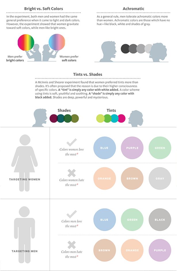
Source: Infographic: How Colors Affect Conversions & Gender and Color
You can create a very powerful and targeted brand color by studying the table above.
By using color combinations that are favored by either male, female, or both, you can alter their perceptions of your brand – subconsciously.
For instance, based on studies, you can see that both men and women like blue and green. Both genders also dislike orange and brown. So if you are targeting both genders, the research says that it would be more advantageous to consider using blue or green as your dominant color (or at least accent color – more below).
This is helpful intelligence to have!
Let’s take it one step further.
How you use color for your brand or products / services, can also be influenced by what emotions your target audience is drawn to.
Let me explain.
 A lot of times, people purchase specific products / services as they subconsciously want to project a certain personality to others.
Being seen strutting down the street with a new expensive purse, or hanging out in a hipster coffee shop, or being seen in a trendy new lounge, all quietly communicate certain characteristics about a person.
Do you get my point? A lot of personal decisions are reflections of who they feel they are, and what they want others to see. It’s an identity people associate with and want others to know about it.
So, if you want to attract people who identify with nature and tranquility, use green. If you want to attract those who want to be seen as youthful or optimistic, try yellow. If your target audience wants to be seen as powerful or luxurious, try black.
Get it?
Take a few minutes and think about your ideal audience, and what they aspire to be identified with. What do they want and how do they want to be seen?
A lot of psychology here, but it’s important for you to consider when building your brand.
How to use your dominant color on your website
Now that you have a dominant color, you want to use color in the right places on your website.
Color attracts a lot of attention, so you don’t want to insert it everywhere.
Here’s a general rule of thumb:
Only use your dominant color in a limited number of places where you want your website visitors to pay attention to, or if you want your visitors to take certain actions (such as call a phone number, fill in a contact form, sign up to a newsletter, etc).
Basically, your dominant color is supposed to “pop” – really highlighting where you want your visitors to focus on.

#2 Choose your accent colors
It is pretty boring to have just 1 single color throughout your entire website.
To make your design more interesting (and professional), you need accent colors to highlight attention-worthy parts of your website like quotes, buttons or subtitles.
Color mixing and matching actually scare a lot of people because it’s not always easy or intuitive to tell which colors blend well together without a good understanding of color theory, and a lot of trial and error.
But, who has time to get a Ph.D. in color theory?! – Not me.
Thank goodness there is a shortcut that everybody can use!! It’s a color matching tool that can help you combine colors like a pro!
How to use a color matching tool to help you select your accent colors
Once you have your dominant color, it’s really easy to find your accent colors by using color matching tools like Adobe Color CC tool.
Adobe Color CC looks complicated, but it is actually a pretty simple tool to use.
We’ve created a short tutorial to show you how to use it to build your color scheme from one of two ways:
(Click below to open tutorial)
How to use your accent colors on your website
Now that you have your complementary accent colors, you can use them to highlight secondary information on your webpages.
These are content / items that are not the main focal points of your page, but you still want them to stand out.
For example, they may be the subtitle, secondary buttons, information boxes, background color, etc.
Try to limit to only 1 or 2 accent colors. If there are too many accent colors, they will create too many focal points that may confuse your visitors.

#3 Choose your website background color
 Have you ever painted a house before?
If you have, then you will probably have some experience with picking a wall color – and you will know that choosing the right wall color can be a challenge.
You want the wall color to make the room to feel comfortable. The color should be soothing enough that you can spend hours in the room without having the color overwhelm you.
At the same time, you don’t want the color to be so boring that the room feels completely sterile.
Choosing a background color is actually a lot like choosing a wall paint color!
You want your website visitors to feel comfortable browsing your website. You don’t want to annoy your visitors or make it challenging to absorb your content by using overly bold or bright background colors. At the same time, you don’t want your website to be so blasé that your audience’s eyes just glazed over any important things you want to say.
How to choose the right background color?
If you were to pick wall colors for a trendy retail store and a summer cottage, would you pick the same colors for them?
Probably not because each space serves a different purpose, so the color you choose should be different.
For example, in a retail clothing store, you might want to use bold colors to draw shoppers to the racks of clothes. You want the wall color to contrast with the merchandise shelves so shoppers can instantly know where to look when they enter the store.
In contrast, you probably want to feel more relaxed in a cottage vacation house. You want your wall color and decor to have a soothing and relaxing effect. You want everything to blend in so you can focus on the breathtaking landscape view from the over-sized window.
In a very similar way, the background color of your website depends on what you want your visitors to focus on.
Simply put, the color you choose as your background color completely depends on the purpose of your website.
Type #1 – Content Intensive Information Websites & eCommerce Websites
Have you ever noticed that most information websites or ecommerce websites usually use white or a neutral background color?
This is because the purpose of these types of websites is to promote ideas or products.
The focus is on the content or products, rather than the design of the website. The background color is only a backdrop to help make the content more visible and readable.
The best color scheme to use for information intensive and ecommerce websites is a white or light background, with bold dominant & accent colors. The bold dominant and accent colors give the website personality and focal points, while the plain background color keeps your visitors’ focus on your content or products.
Type #2 – Corporate / Business Websites
Corporate / business websites usually have two purposes — Promoting the brand or its services.
Depending on which purpose your business website wants to focus on, your background color will be different.
Promoting a Brand
When you want to build a strong brand identity, you should use various shades of your dominant or brand color as your background color.
This is because color is closely tied to brand recognition (remember our example of Coca Cola above?) When you use a variation of your dominant/brand color as your background, you are reinforcing your brand and makes it more memorable to your audience.
If you have a very bold brand color, using it as your background color can be too overwhelming. If that was the case, consider choosing a less intense shade of your brand color instead. Use Adobe Color CC tool to generate different shade and brightness of your dominant color.


Promoting a Service
If you want the value of your service or your portfolio of past projects to be the focal point, use white or a neutral background color.
Just like content intensive and ecommerce websites, you don’t want your background color to take the focus away from your content or the message you want to communicate.
By choosing a neutral or white background, your content will naturally become more attention grabbing.

Type #3 – Stylish & Creative Websites that are Graphic Intensive
For websites used in fashion, design, restaurant, beauty and creative industries, the world is your oyster.
There are really no rules as to what background image or colors you should use. You can use a black menu bar to create more drama; Or you can use all the colors of the rainbow to create an inspirational background image.

Honestly, here you can break all the rules and use any color you like as long as you keep this 1 rule in mind — “Never choose a background that makes your text or content hard to read.“
Your perfect background color is one that allows your content to be the focal point while working harmoniously with your dominant & accent colors, and makes your audience feel good while browsing your website.
When in doubt, use white or very light gray as your background color. While it might not be the most inspiring color, you know your content will always shine through.


Comments
Post a Comment